

The most compelling research presentation I gave broke every academic convention.
Most research talks follow a tired script:
Intro → Methods → Results → Conclusion.
But that order buries your message.
After giving hundreds of talks, I’ve found that the best ones flip the script—and put the audience first.
Here are 3 changes I made that had the room buzzing:

1️⃣ Lead with the destination
Start with your core message. The one-sentence takeaway you want them to remember 6 months later.
Example: “We found that patients with newly diagnosed diabetes who received dietitian support within 3 months had 40% better glycemic control at 1 year.”
That’s the whole story in a nutshell. Now you’ve bought their attention. They’re not wondering “WHAT the point is?” They’re tracking HOW you got there.
This mirrors how we read papers. Abstract/Conclusion first. Details later.
So flip the order. Give them the destination before the map.
2️⃣ Use figures to tell the story
Tables are great—for print. But when you flash a 10×10 matrix of p-values on a slide?
You lose people.
A clean figure, though—like a bar graph showing BP reduction by intervention group—instantly tells the story.
Example: If your figure shows that “Combined diet and medication intervention” reduced BP by 15 mmHg versus 2 mmHg in the control group, that’s instantly memorable. No explanation needed.
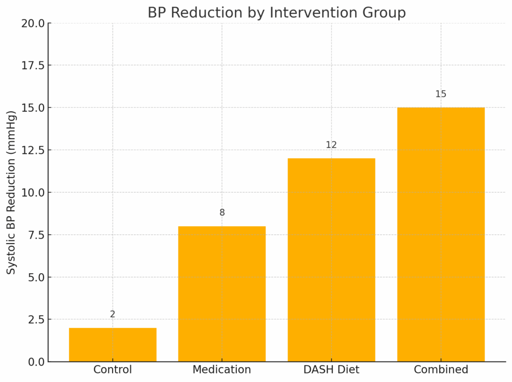
In one stroke, the audience gets it: lifestyle change beat meds alone. That’s sticky.
If it takes more than 5 seconds to understand your slide, it doesn’t belong.
3️⃣ Own the space
Don’t pace. Don’t float. Pick 3 people—left, center, right—and rotate eye contact.
Stand firm. Deliver like you mean it.
Your ideas should move. Not your feet.
Think of the best grand rounds you’ve attended. The speaker wasn’t flashy. They were grounded. Calm. Present.
You don’t need to perform. You just need to be there.
And, just as important— what to AVOID:
1️⃣ Don’t read your slides
Your slide is the backdrop, not the script.
Use keywords. Speak to the audience, not the screen.
❌ Example to avoid:
You show a slide that says, “Our study found that initiating SGLT2 inhibitors within 30 days of diagnosis was associated with a 30% reduction in hospitalization for heart failure in diabetic patients…”
Then you read it. Word for word.
The audience tunes out. Because they can read it themselves.
✔️ Instead, say:
“We tested SGLT2s early. Here’s what happened: fewer hospitalizations. Dramatically fewer.”
Let your tone and presence carry the insight.
2️⃣ Don’t drown your slides in text
You’re not writing a manuscript. You’re telling a story.
Keep it to 5–6 short lines. Ditch the punctuation. Let the visual space guide their eyes.
❌ Example to avoid:
Slide filled with text:
“Diabetes is a chronic metabolic condition characterized by elevated blood glucose levels resulting from defects in insulin secretion, insulin action, or both. The long-term complications of diabetes include retinopathy, nephropathy, and cardiovascular disease.”
By the time you reach “retinopathy,” they’ve mentally checked out.
✔️ Instead, use:
- Chronic condition
- Insulin resistance
- Risk: eyes, kidneys, heart
- Goal: glycemic control
- Timeline: 1 year outcomes
Then speak to those.
Too much text = instant tune-out.
3️⃣ Don’t say “I know you can’t read this”
If you have to say it, don’t show it.
Break up big figures. Crop your tables. Zoom into what matters.
❌ Example to avoid:
You pull up a regression output table with 20 variables, 3 models, and a scroll bar on the side.
Then you say, “I know this is a bit dense, but…”
That’s your cue. Delete. Or split into two slides.
✔️ Instead, highlight just the key predictors:
“Obesity and baseline CRP >10 were the strongest predictors of non-response.”
Then show a simple bar graph or odds ratio plot for those 3–4 factors.
Make it visual. Make it land.
Respect your audience’s attention. Every slide should feel intentional.
You don’t need animations. You don’t need cinematic music.
You need clarity.
Presence.
Structure.
That’s what turns a data dump into a research talk people will talk about.
What’s one change you’ll make in your next talk to better serve your audience?